“In visual perception a color is almost never seen as it really is.” — Josef Albers
I discovered Josef Albers’ work and color theory a few years ago, a reading that deeply resonated with me and continues to shape my daily practice. With this project, I wanted to explore how to apply his research on color interaction to product imagery.
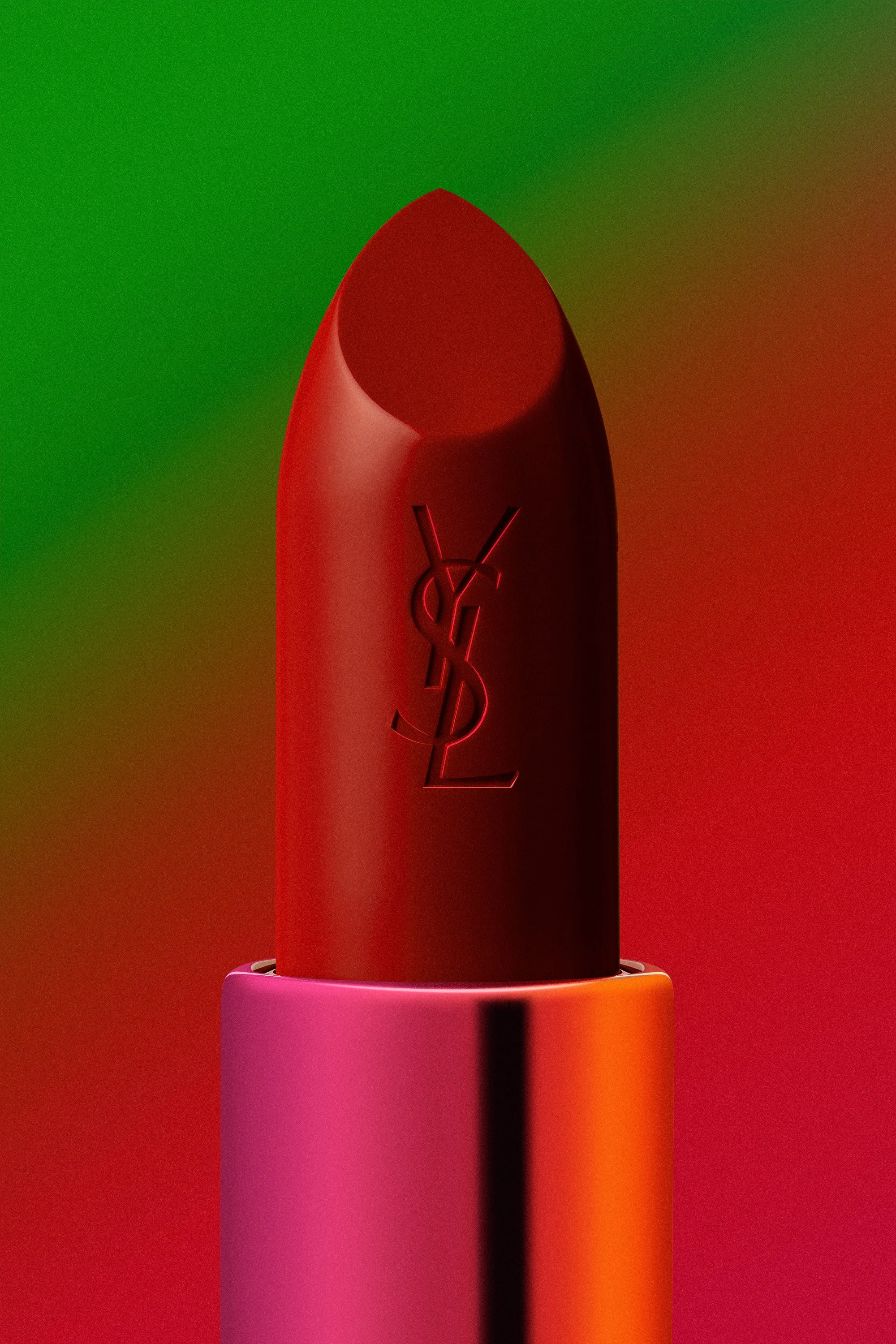
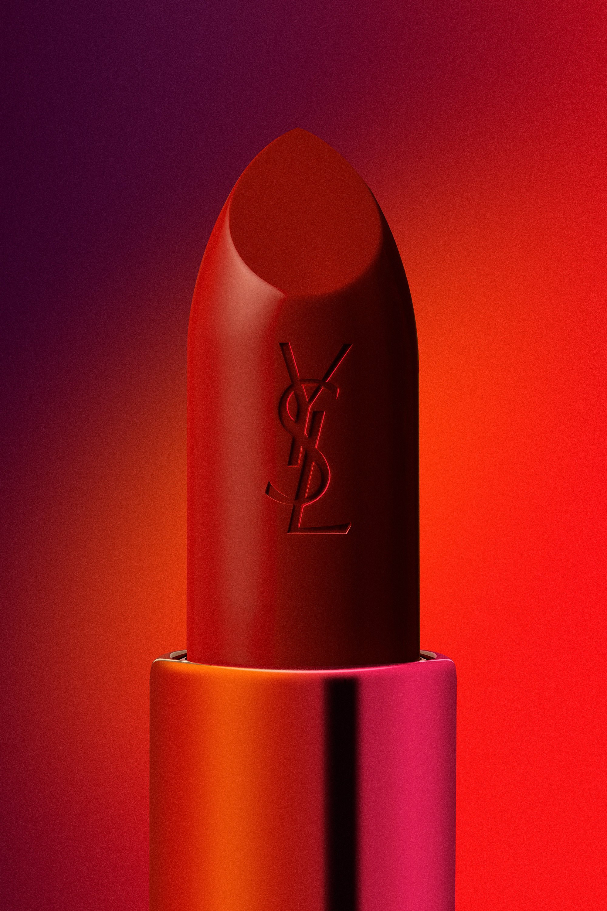
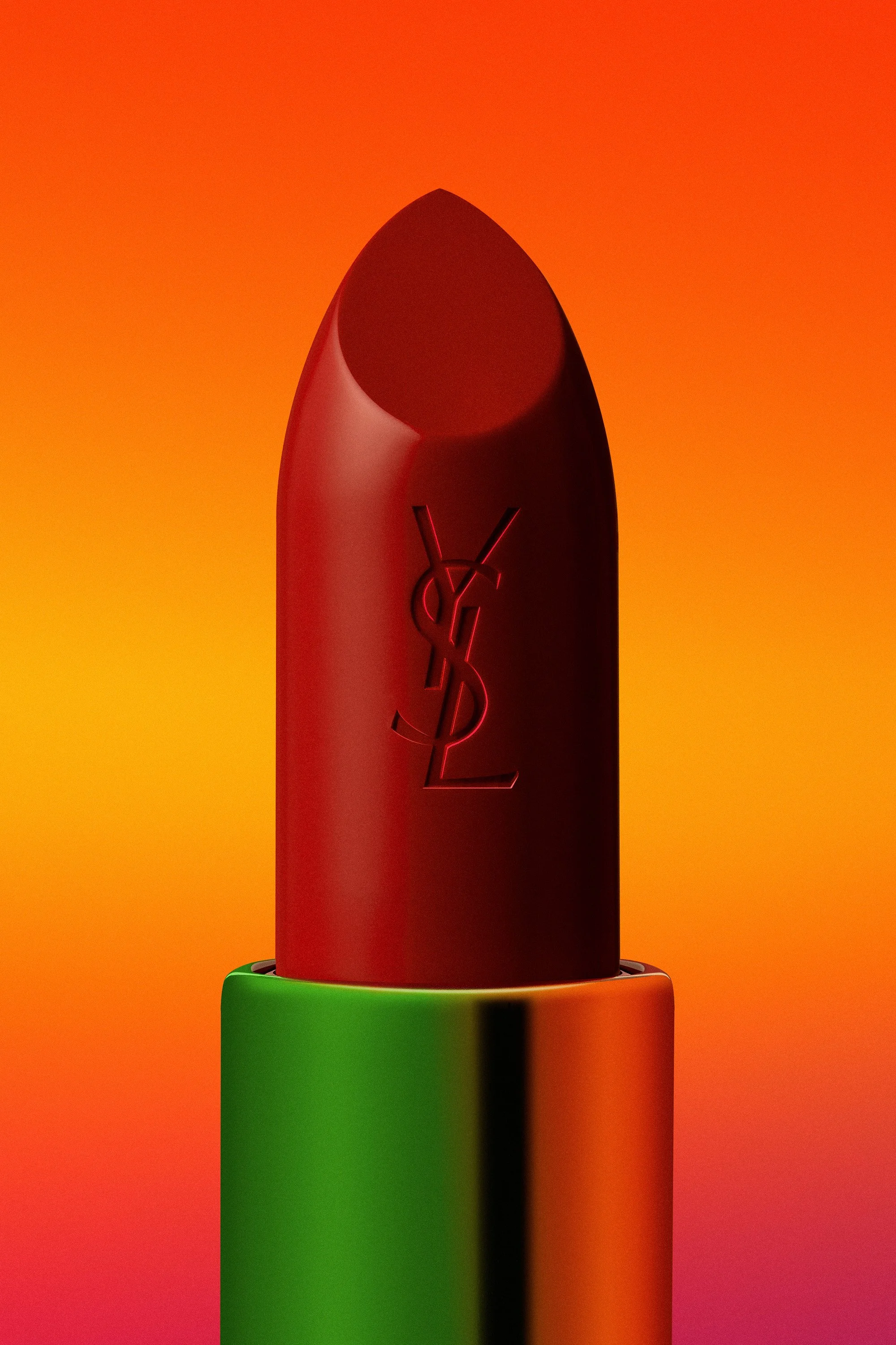
The lipstick remains strictly identical from one image to the next, while its chromatic environment shifts. By confronting this fixed red with saturated backgrounds and reflections, electric green, magenta, orange, I sought to alter its perception through complementary contrasts.
The imagery pursues a hyperrealistic finish, pushing the crispness of the engraved monogram and the raw texture of the bullet into sharp detail. This series functions as a visual study, an optical exercise.